Hexdump
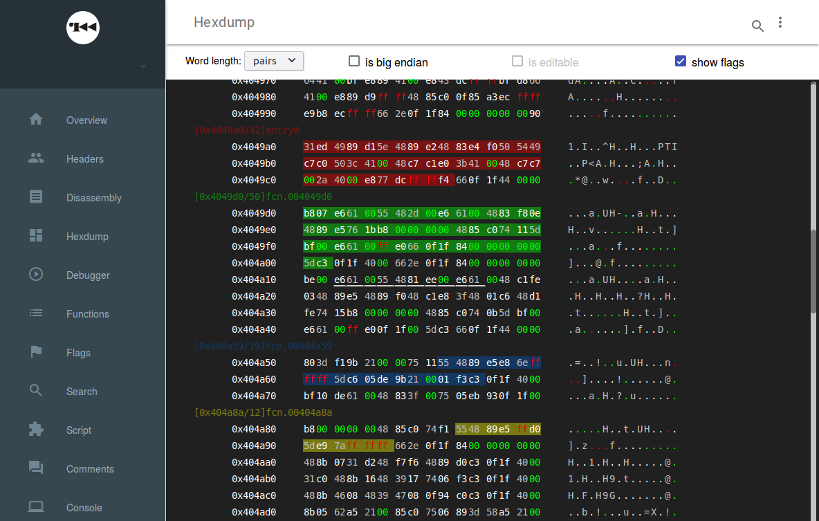
Past few days, I’ve been working on a the hexdump panel. The purpose is to take bytes and make them readables and be able to navigate inside. The functionnalities needed was the next:
- infinite scrolling
- colorizations: address location and bytes
- switch endian
- show words of different size
- add flags and highlight the region
- some selections features
- inline editing in ascii and hex code
The purpose is to transform this kind of hex chains:
31ed4989d15e4889e24883e4f050
into this:

Challenges
I would like to share my experience over some elements.
First, is good to know that r2 allows to retrieve blocks with a limited size. This is not bad considering how heavy the DOM can become when we load too much data.
Heavy DOM
The performance problematic has begun since the beginning with this tool. We have to communicate with r2, process the return and load the data into the DOM. There is several potential bottlenecks if not handled properly.
We wanted to be able to scroll infinitely inside the binary but we don’t want to load all the data in the DOM and minimize the time awaiting to receive and process the data from r2.
The solution has come by defining a visual block of 2 screens (I use some JS to get the true height where the dump will be shown). Then, I always show 3 blocks for a total of 6 screens. And, by analyzing the scroll position, I trigger the loading of the next/previous block when we go further than 25 or 75% of the visual space: less than 1,5 screen to scroll.
To ensure performance, there is always one more block at each extremity processed in the back (I call it the hexpair navigator). It allows to load the DOM quickly and then retrieve one more block. All block are stored inside the navigator as an history but the UI has constantly 3 blocks visibles, whatever the situation.
There is some room to improve performance here, with more anticipation and add some visual elements to help follow the autoscrolling part. Also, the retrieving part could be done with background processing through promises. I will give it a try soon.
Selection
The selection part wasn’t challenging at first. Then, I opened Chrome and the beautiful “Discontigious Selection is not supported”.
So, the selection part was here to let the user make a selection on the pairs. But, as the structure is based on an imbrication of lists, the default behavior isn’t suitable. So, I’ve decided to rewrite it by playing with mousedown and mouseup. Things was then added to Range and after to a Selection. The result was working good, but Chrome can’t handle the fact I was building a selection with multiples ranges. So, I’ve emulated the selection process with some CSS and JS.
This compromise was possible since the purpose of the selection isn’t to copy thing but more to trigger an action through a callback. With this current implementation, you can define a list of actions that will receive the JS Event and a range that sourround the current selection.
How to edit?
The purpose here was to permit to modify the binary, from ASCII or from bytes.
Not a challenge but the first time I found very helpful the contentEditable property. By clicking on a byte, the item become editable and then you can write whatever it’s suitable and valid the result by losing focus or pressing enter.
The modification trigger a function that will create a visual tracker to show you where the binary has been updated, transfer the information to the hexpair navigator to store this new information in case we scroll over it later and then execute a callback we will define later to inform r2 about this update.
I’ve encountered a minor problem when I’ve implemented this feature. It was about a conflict between the events when clicking on an byte. I solved this by letting the user chosing between selection or editing through a checkbox.
EDIT Finally, that’s not a so good idea. Browsers have differents implementations about this property but they all have a behavior we don’t want here: they add breakline (br or p tags). I’ve replaced them by input and it finally work as expected, whatever the content left in the field.
This part wasn’t that easy and there is some room to improve this tool, yet, the evolution is visible and this part of the UI has gained in usability.